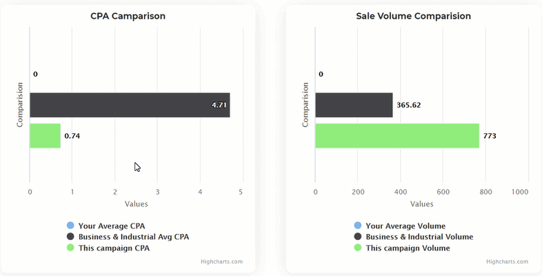
Whenever our AI gives you a prediction, it is always accompanied with graphs. The graphs compare the performance of your campaign against campaigns run by other Peasy users based on 2 primary criteria: 1) cost, and 2) volume of sales, and the average benchmark for your industry.

For example, take a look at the CPA Comparison (Graph 1) and Sale Volume Comparison (Graph 2) above. In Graph 1, the green bar represents your current campaign CPA while the black bar represents the average CPA of other campaigns by other users within the same industry.
Graph 1 shows that on average, other users within the same industry are paying about MYR 4.71 for every click, and based on Graph 2, they are getting about 366 clicks within the same duration as your campaign. In comparison, your campaign (represented by the green bar) is predicted to achieve 773 clicks, almost twice the average benchmark (366 clicks), at a rate of MYR 0.74 for every click, which is 6 times lower than the average benchmark rate (MYR4.71).
Based on the graphs provided, you can reasonably assess that your campaign will outperform campaigns by other users, so you can go ahead to deploy your campaign.
How to edit recommended audience
Firstly, we highly discourage you from editing our AI’s recommendation...
Read MoreHow to get the best recommendation
What if you want to further optimise our AI’s recommendation?...
Read More


